Course Appearance
Let's make your course stand out from the crowd!
The look and feel of your course play a vital role in catching the attention of potential learners. With the right visuals and tags, your course can stand out in a sea of options. Here's how to make sure it looks just right.

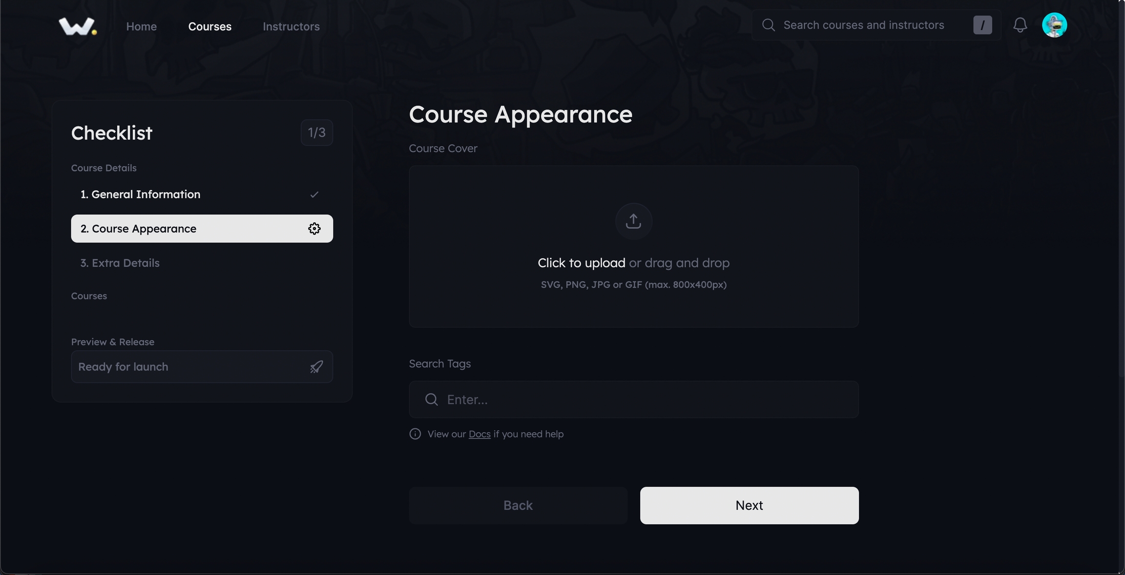
Course Cover: Every great course deserves an equally captivating cover.
Click on the Course box to select and upload your file.
For the best outcome, keep your image dimensions within 800px (width) x 400px (height). Our specialized image resizer component will then swoop in and tweak it for a seamless fit on the platform.
Crafting the Right Tags: Tags act as a magnet, pulling in interested learners by making your course discoverable.
Simply click on the tag field and type in a keyword that best describes your course. Once done, hit the 'Enter' key.
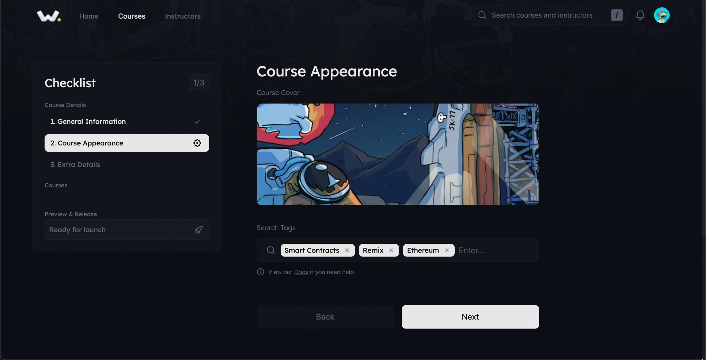
These tags will then appear as a preview on the course page, giving potential students an idea about the course topics at a glance.

Preview and Move On: Once you've got the appearance just right, it should resemble the illustration provided below. Take a moment to review, and if all looks good, you're ready for the next step!

Last updated
